


Most Shopify store owners approach A/B testing backward.
They pick a random element to test (usually a button color), run the test for a few days, declare a winner, and wonder why revenue barely moves.
Here's the truth: A/B testing tools don't drive results. Understanding why your customers aren't buying drives results. The testing is just how you validate solutions.
This guide will show you how to actually use Shopify A/B testing to increase conversions, not just run tests for the sake of testing.
What is Shopify A/B Testing?
Understanding Split Testing for E-commerce
A/B testing (also called split testing) means showing two different versions of something to your visitors and measuring which one performs better.
Version A might have a blue "Add to Cart" button. Version B has a green one. You split traffic 50/50 between them and see which converts better.
That's the mechanics. But the mechanics are the easy part.
The hard part is knowing what to test and why. Most stores waste months testing things that don't matter while ignoring the real conversion barriers.
Why A/B Testing Matters for Shopify Stores
The economics of Shopify conversion are unforgiving, and most store owners underestimate how much revenue they leave behind.
Average ecommerce conversion rates sit around 2% to 3% globally. That means 97 out of 100 visitors leave without buying. At that baseline, small lifts are not cosmetic. A 0.5% improvement on a $500K/month store is $30K in annual revenue from the same traffic.
Around 70% of shoppers abandon carts after adding items. If you are not testing cart and checkout changes, you are leaving your biggest leak untouched.
Baymard Institute estimates the average large ecommerce site could gain a 35.26% increase in conversion rate through better checkout design. You will not get that lift through “best practices” alone because the winning fixes vary by store. You get it by testing.
The causes of cart abandonment are specific and testable. Baymard reports 48% leave due to extra costs (shipping, taxes, fees), 24% because they are forced to create an account, and 18% due to trust concerns with payment data. These are not opinions. They are measurable problems you can A/B test against.
Page weight matters too. Google reports that as the number of elements on a page goes from 400 to 6,000, the probability of conversion drops 95%. Shopify themes and apps can push you toward bloat fast, so testing layout and content density is not optional.
When you do hit a real lever, the upside is concrete. Carnivore Snax saw an 11.7% increase in average revenue per user within 90 days after we identified their core conversion barrier through research and tested a targeted solution. That is what happens when testing is pointed at a real problem instead of a random element.
The question is not whether to test. The question is whether you are testing the right things.
Enavi's Approach to Shopify Conversion Optimization
The 80/20 Methodology: Research-First Testing
Most Shopify brands do not have a testing problem. They have a prioritization problem.
They are not short on ideas. They are drowning in them. Homepage changes. PDP redesigns. Cart tweaks. New apps. New offers. New bundles. New landing pages. Everyone has opinions, but very few teams have enough evidence to know which change is most likely to move revenue.
That is where most CRO programs go off the rails.
They confuse activity with progress. They launch tests too early, test weak ideas, and end up with a low win rate, slow learning, and a backlog full of guesses. Enavi takes the opposite approach. We put the bulk of the effort into understanding the customer, the journey, the friction, and the economics before a test ever goes live. That is why our model is research first. We spend 80% of the effort on diagnosis and only 20% on execution. Not because testing matters less, but because better research makes testing sharper, faster, and far more likely to produce meaningful lifts.
This matters because a test is only as strong as the thinking behind it. If you test the wrong thing, clean setup will not save you. Elegant design will not save you. Statistical significance will not save you. You will just get a precise answer to a weak question. Our process is built to avoid that trap. We use research to identify where intent is strongest, where it collapses, which segments are worth protecting, what objections are blocking action, which messages are not landing, and what parts of the funnel are creating the biggest commercial drag. Then we use testing to validate the highest value hypotheses, not random page ideas. That is the difference. We are not running experiments to look busy. We are running them to solve the right problems in the right order.
80% Research Across 11+ Methods
Our research stack is built to remove guesswork from Shopify conversion optimization. Each method gives us a different angle on the same problem, so we can see not just what is happening, but why it is happening and what to do about it.
1. Technical Analysis
We audit site speed, device specific performance, bugs, template inconsistencies, app conflicts, and technical friction that can quietly suppress conversion.
2. QA Smoke Test
We manually pressure test the experience across key journeys to catch broken flows, sloppy execution, and trust killing issues that analytics alone will miss.
3. UX and UI Audit
We evaluate clarity, hierarchy, usability, information flow, and buying friction across the core templates that shape conversion.
4. Data Tracking and Enrichment
We verify tracking quality, clean up blind spots, and enrich the data so decisions are based on reality instead of broken reporting.
5. Review Mining
We analyze customer reviews to uncover buying triggers, objections, anxieties, desired outcomes, and the language real customers use.
6. Client Value Proposition Questionnaire
We extract what the internal team believes matters most, then compare that with customer behavior and evidence from the market.
7. Heatmap Analysis
We study clicks, scroll depth, rage clicks, dead clicks, and attention patterns to understand what users notice, miss, and struggle with.
8. On Site Polling
We ask visitors targeted questions during the journey to surface hesitation, confusion, and intent in the moment it happens.
9. Post Purchase Survey
We capture why customers bought, what convinced them, what nearly stopped them, and which channels or messages drove the decision.
10. Intra Site Funnel Analysis
We map how users move between templates, channels, devices, and key steps to find where intent strengthens, leaks, or dies.
11. Customer Canvas
We bring everything together into one decision making framework that shows who the customer is, what they want, what blocks them, and where the highest value opportunities sit.
20% Strategic A/B Testing (Minimum 3 Tests/Month)
Once we know what to test, we move fast. Minimum 3 A/B tests per month, prioritized by potential impact.
But because we've done the research, our test win rate is significantly higher than the industry average (12% - 15%). We're not guessing. We're solving problems customers already told us about.
Ours consistently outperforms that range because we are not guessing. We are solving problems customers have already told us about."
The Metric on Fire Focus
Every Shopify store has a metric on fire.
It is the one step in the funnel where user intent breaks down more than it should, and where the gap between current performance and expected performance is too large to ignore.
For some brands, that problem sits between the product page and add to cart. For others, it shows up in cart abandonment or checkout completion. The point is simple. Every store has one part of the journey that is hurting growth more than the rest.
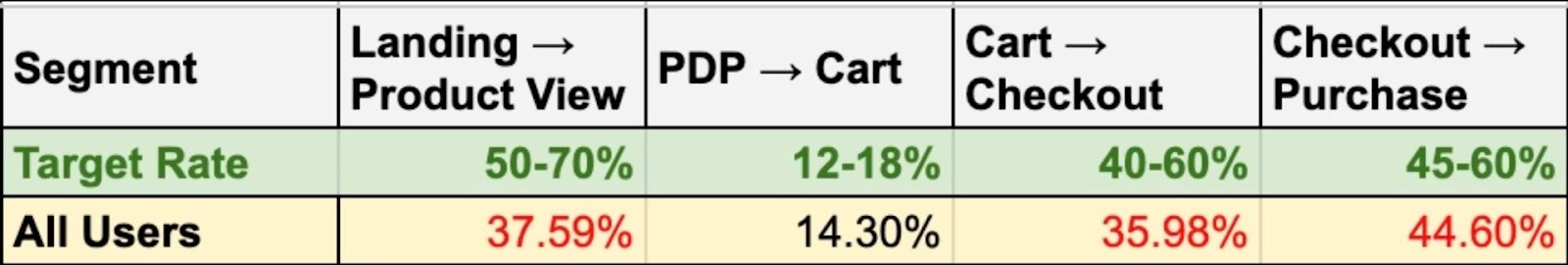
In the example above, the metric on fire is Landing to Product View.
The target range for that step is 50 to 70%, but the store is only converting at 37.59%. That is the biggest performance gap in the funnel, which tells us the main issue is not product page conversion. It is getting more visitors from landing pages into product discovery in the first place.
That is where the biggest opportunity sits. If the store can move more users from landing pages into product views, it feeds more qualified traffic into the rest of the funnel and creates more downstream revenue without needing to fix everything at once.
Human-Obsessed vs. Tool-Dependent Testing
Most guides will tell you to install an A/B testing tool and start running tests.
We think that's backward.
Tools are just mechanisms for showing different versions. They don't tell you what to test or why. They can't identify your conversion barriers. They can't interview your customers.
Our approach is human-obsessed: deeply understand why people aren't buying, then use tools to validate solutions.
Best Shopify AB Testing Tools
Native Shopify A/B Testing Capabilities
Shopify doesn't have built-in A/B testing for most elements. You can test themes by duplicating them, but it's manual and limited.
For serious testing, you'll need third-party tools.
Third-Party Testing Tools
Intelligems
Intelligems is solid for Shopify. It handles product pricing tests, shipping tests, and cart tests well. Good statistical engine. Relatively easy to implement.
Pricing is usage-based, which scales with your revenue. Expect to pay several hundred to several thousand per month, depending on volume.
Neat A/B Testing
Neat specializes in Shopify theme testing. Simpler than Intelligems, more limited in scope, but easier to use if you're just testing visual elements.
Good for stores that don't need complex pricing or cart tests.
Convert
Convert is an enterprise-grade testing platform that integrates well with Shopify through custom scripts. It supports A/B, split URL, and multivariate testing with strong targeting and segmentation options.
Where Convert stands out is its privacy-first approach no third-party cookies and its advanced reporting, including Bayesian and frequentist statistical models. It is a good fit for stores with complex testing needs or strict data governance requirements.
VWO (Visual Website Optimizer)
VWO provides a full optimization suite: A/B testing, heatmaps, session recordings, and surveys in one platform. It integrates with Shopify and offers a visual editor for building test variations without code.
The breadth of the platform is useful if you want research and testing tools in a single environment. Pricing starts higher than Neat or Intelligems, but includes capabilities that would otherwise require multiple subscriptions.
Why Tools Alone Don't Drive Results
Here's what nobody tells you about A/B testing tools:
The tool is maybe 10% successful. The other 90% is:
- Knowing what to test (research)
- Understanding why you're testing it (hypothesis formation)
- Designing variations that actually solve problems (strategy)
- Running tests to statistical significance (patience)
- Implementing winners correctly (execution)
You can have the best tool in the world and still see zero revenue impact if you're testing the wrong things.
How to Split Test Shopify: Step-by-Step Process
Step 1: Identify Your Metric on Fire
Before testing anything, figure out where your biggest drop-off is.
Look at your conversion funnel:
- How many people view products?
- How many add to cart?
- How many start checkout?
- How many complete purchase?
Your Metric on Fire is where the drop-off is most severe compared to benchmarks.
If 1,000 people view products but only 50 add to cart, that's your Metric on Fire. Start there.
Step 2: Conduct Deep Customer Research
Now figure out why people are dropping off at that point.
This is where most stores skip straight to testing and waste months. Don't do that.
Watch session recordings of people who dropped off. Send surveys to people who abandoned cart. Interview recent customers. Read support tickets.
You're looking for patterns. What are people confused about? What information is missing? What's stopping them from trusting you?
Step 3: Form Hypotheses Based on Insights
Turn research insights into testable hypotheses.
Bad hypothesis: "Green buttons will convert better than blue buttons."
Good hypothesis: "Customers are abandoning cart because they're surprised by shipping costs. If we show shipping costs earlier, cart abandonment will decrease."
See the difference? The good hypothesis is based on a real customer problem identified through research.
Step 4: Design Test Variations
Create variations that directly address the problem in your hypothesis.
If customers are confused about sizing, your variation should add a size guide or comparison chart. If they don't trust your return policy, make it more prominent and specific.
Don't just make things look different. Make things solve problems.
Step 6: Implement Winners and Iterate
When you have a statistically significant winner, implement it permanently. Then move to the next test.
Document what you learned. Not just "variation B won" but why you think it won and what that tells you about your customers.
These learnings inform future tests and compound over time.
What to A/B Test on Your Shopify Store
Most A/B testing advice gives you a to-do list: test headlines, CTAs, images. That's not a strategy. The real question is: given your data, what's the highest-leverage test you can run without wasting four weeks of traffic?
Landing Page Optimization Shopify: Start With the Data
Before you test anything, answer three questions:
Where is the biggest drop-off by traffic source? Segment bounce rate and scroll depth by source/medium in GA4. If paid social bounces at 70% while organic sits at 35%, you have a paid social landing page problem, not a landing page problem. That changes what you test entirely.
Is the drop-off above the fold or below it? Leaving before seeing your value prop = relevance problem (ad-to-page mismatch). Leaving after = persuasion problem. Different diagnosis, different test.
What does qualitative research specifically say? Not "trust is a barrier." Did PPS respondents almost not buy because of shipping uncertainty? Did user testing reveal people couldn't figure out what makes you different within five seconds? Vague research produces inconclusive tests.
Hero Section Testing: Stop Testing "Different Images"
If LP → PDP click rate is low across all segments, you likely have a clarity problem. The test isn't "Image A vs Image B." It's whether a hero that immediately communicates what you sell outperforms one that leads with aesthetics.
Every hypothesis should follow this structure:
“Because [evidence], we believe [specific change] will [improve specific metric] for [specific segment]. Primary metric: [X]. Guardrails: [Y, Z]. Duration: [based on sample size].”
Example: "Because 62% of PPS respondents didn't understand we're subscription-based (Source: On-site Poll Q2), adding 'Delivered Monthly - Cancel Anytime' to the hero subheadline will increase LP → PDP click rate for new paid social visitors by 15%. Guardrails: bounce rate, PDP → Cart. Duration: 3 weeks at 40K sessions."
If drop-off is segment-specific, account for it. A hero that wins on desktop might fail on mobile. If 30% of paid social traffic comes through Instagram's in-app browser, check whether your hero even renders properly there — WebView quirks won't show up in top-line data.
Value Proposition: Specificity Beats Cleverness
"More prominent, more specific, or more customer-focused" describes three different tests. Don't stack them.
Prominent = visibility problem. Test layout. Specific = differentiation problem. Ground it in customer language: if review mining shows 40% of positive reviews mention freshness and 8% mention origin, lead with freshness. Customer-focused = framing problem. Test outcomes over features, but only if qual confirms comprehension is the barrier.
CTA Copy: Probably Your Lowest-Leverage Test
By the time someone looks at your button, they've decided. The friction is the decision architecture above it.
If PDP → Cart is low, audit the decision block first: Can users figure out size/dose/coverage without leaving the page? Is shipping visible? Returns summary present? Price contextualized? On mobile, is the CTA even on-screen or buried under upsell widgets?
CTA tests only matter when commitment anxiety is research-backed (high-AOV, first-time subscriptions). "Add to Cart" vs. "Try It Risk-Free" works there, but you're testing risk-reversal messaging, not button copy. Better traffic investments: sticky ATC on mobile for scroll-heavy PDPs, or "In Stock — Ships Tomorrow" next to the CTA for high-abandonment segments.
Pre-Flight Shopify A/B Testing Checklist
Traffic. 10K sessions/month at 3% conversion needs ~8 weeks to detect a 20% lift. Can't wait? Test bigger swings or pick higher-traffic pages.
Metrics. One primary, two guardrails minimum. A test that lifts LP → PDP but tanks PDP → Cart didn't win.
Segments. A 12% overall lift might be +25% on desktop Chrome and -5% on mobile Safari in-app. Always break by device, browser, and source before calling a winner.
Research foundation. No specific evidence backing your hypothesis? You're guessing and that's expensive at four weeks per test.
Product Page Optimization Shopify
Image Gallery: Test What Customers Need to Evaluate, Not What Looks Good
"Test lifestyle vs. flat lay" is the wrong framing. The right question is: what information does the customer need from images to make a buying decision, and are they getting it?
This varies by product category and by the specific anxiety your research surfaces. If review mining shows sizing is the #1 concern, your first image test isn't lifestyle vs. flat lay, it's whether adding an on-body scale reference image (model stats visible, product measurements overlaid) reduces size-related hesitation enough to lift PDP → Cart. If your returns data shows "looked different than expected" as a top reason, test adding texture close-ups or true-to-color swatches.
Product Descriptions
"Test long vs. short descriptions" is a false choice. The real issue is whether the right information is visible at the right moment in the buyer's decision process.
Most Shopify PDPs make one of two mistakes:
They front-load brand storytelling and bury specs. This works for impulse-buy, low-consideration products. It kills conversion for anything where the customer needs to compare, calculate, or verify compatibility. If your product requires the buyer to confirm fit, dosage, coverage area, or compatibility, that information needs to be above the fold or inside the decision block — not hidden in a tab.
They dump everything into a wall of text. Session recordings will show you exactly what happens: users scroll past it. If scroll depth data shows people skip your description entirely, the problem isn't the copy. It's the format. Test chunking specs into a scannable format (comparison tables, expandable sections, icon-based feature highlights) against your current wall of text.
How to decide what to test: Map your product description to the top 3 questions or anxieties from your qualitative research. If post-purchase surveys show "I wasn't sure about the dosage" or user testing reveals "I couldn't tell if this fits my space," those are your test priorities. Not length. Not tone. Whether the specific information that resolves the purchase barrier is findable and clear.
One thing most stores miss: Product descriptions perform differently by traffic source. A returning customer from email already knows what you sell — they're checking price and availability. A first-time visitor from paid social needs the full education. If you can't personalize by segment, optimize for the segment with the most revenue upside, then verify results hold across others.
Improve Shopify Checkout
Checkout Flow Simplification
Test reducing form fields, combining steps, or adding progress indicators.
If cart abandonment analysis shows people are dropping at the shipping address step, that's where to focus.
Trust Signals and Security Badges
Test security badge placement and messaging. If customers are abandoning at payment entry, they might not trust your checkout security.
But don't add random badges that mean nothing. Use real signals like SSL certificates, payment processor logos, and money-back guarantees.
Reduce Cart Abandonment Shopify
Cart Page Urgency Elements
Test adding scarcity or urgency messages, but only if they're true. "Only 3 left in stock" works if it's accurate. "Sale ends soon!" works if the sale actually ends.
Fake urgency erodes trust.
Exit-Intent Offers
Test exit-intent popups with discount codes. But be strategic: if you train customers to abandon cart to get a discount, you're hurting yourself long-term.
Test alternative retention tactics first: free shipping threshold, bundle offers, risk-reversal guarantees.
Shopify CRO Best Practices
Start with $250,000/Month Minimum Revenue
If you're doing less than $250K/month, you probably don't have enough traffic for meaningful A/B testing.
A/B tests need statistical significance. That requires transaction volume. Below $250K/month, focus on driving more traffic and fixing obvious conversion issues.
Focus on One Metric on Fire at a Time
Don't run 10 tests simultaneously across your entire funnel. Focus on your biggest bottleneck until you've made meaningful progress.
This focused approach gets results faster and teaches you more about your customers.
Run Tests to Learn More About Your Customers
The strongest experimentation programs do not treat tests as a way to decorate pages or chase random uplift. They use them to expose how customers actually make decisions. Every meaningful test is a chance to learn what people notice first, what they ignore, what reassures them, what creates doubt, what speeds up action, and what causes hesitation right before the point of conversion. That matters because analytics can tell you where performance is weak, but they cannot fully explain the motivation behind the behavior.
A page with high traffic and poor conversion could be suffering from weak message match, low trust, unclear product differentiation, poor information hierarchy, pricing anxiety, choice overload, or friction in the buying path. A well designed test helps isolate which of those forces is doing the damage. When you compare one experience against another, you are not just measuring which version won.
You are gathering evidence about customer psychology. You are learning whether buyers respond more to outcome driven copy than feature driven copy, whether they need stronger proof before acting, whether urgency motivates action or creates resistance, whether simplified choices increase confidence, and whether certain audiences need a completely different buying journey than the one you assumed.
Document Everything
Keep a testing log: what you tested, why you tested it, what you learned, and what won.
This documentation becomes your strategic asset. Future tests build on previous learnings.
Think Beyond Sticky Buttons
Sticky add-to-cart buttons, aggressive popups, and countdown timers might increase short-term conversions but damage long-term brand value.
Test changes that solve real customer problems, not tactics that just create friction.
Real Results: Shopify A/B Testing Case Studies
Carnivore Snax: Product Discovery Optimization
Research showed customers didn't understand the value of buying multiple flavors. They were treating it like a commodity when they should have been excited about variety.
We tested restructuring product pages to emphasize variety packs and added social proof about multi-flavor purchases.
Result: 11.7% increase in average revenue per user in 90 days.
FAQ: Shopify A/B Testing
What is the best A/B testing tool for Shopify?
Intelligems is our top recommendation for comprehensive Shopify testing; it handles pricing, cart, and checkout tests well. Neat A/B Testing is simpler and good for basic theme testing. But honestly, the tool matters less than your testing methodology. We've seen stores with expensive tools get zero results because they're testing the wrong things. Focus on research-driven testing first, then pick a tool that fits your needs and budget.
How do I increase my Shopify conversion rate?
Start by identifying your Metric on Fire, the point where most people drop off. Then conduct research to understand why they're dropping off at that point. Common issues: unclear value proposition, trust concerns, confusing navigation, hidden costs, complicated checkout. Once you know the problem, test solutions systematically. Our 80/20 methodology (80% research, 20% testing) consistently delivers 5-7:1 ROI because we fix real problems instead of guessing.
How many visitors do I need for Shopify A/B testing?
You need enough traffic to reach statistical significance, usually 95% confidence minimum. For most Shopify stores, that means at least 100 conversions per variation. If you're doing $250K+/month in revenue, you probably have enough traffic. Below that, testing takes so long it's not worth it, focus on driving more traffic and fixing obvious issues first. Use an A/B test calculator to determine required sample size for your specific conversion rate.
What should I A/B test first on my Shopify store?
Test whatever is causing your Metric on Fire, your biggest conversion bottleneck. If product-to-cart rate is terrible, start with product pages. If cart abandonment is high, start with cart experience. Don't test random elements because a blog post said to. Conduct research first, identify the real problem, then test solutions to that problem. This focused approach delivers results faster than scattershot testing.
How long should I run A/B tests on Shopify?
Minimum 2-4 weeks to reach statistical significance, longer if you have lower traffic. Don't call winners after a few days or a few dozen conversions, you'll make decisions based on noise, not signal. Run tests until you hit 95% confidence with at least 100 conversions per variation. Yes, patience is hard. But accurate results are worth waiting for.
Can I do A/B testing without apps on Shopify?
Technically yes, but it's manual and limited. You can duplicate themes and manually switch between them, but you can't split traffic automatically or track results properly. For serious testing, you need a third-party tool like Intelligems or Neat. The investment pays for itself quickly if you're doing meaningful tests. Don't let tool costs prevent you from optimizingt, the revenue lift from good testing far exceeds the tool cost.
Ready to Actually Increase Your Shopify Conversion Rate?
A/B testing tools are easy to find. Knowing what to test and why is hard.
If you're doing $250K+/month and ready to stop guessing, schedule a free CRO strategy call. We'll identify your Metric on Fire and show you exactly what we'd test first.
No generic advice. No tool recommendations. Just honest insights about where you're losing money and how to fix it.
