


Shopify brands unknowingly commit a major unforced error every day.
Despite spending millions to drive traffic to their site, they don’t have an accessible way to understand how well it is performing.
As a result, they rely on hunches, anecdotes, and whoever can shout the loudest about what needs to change on the site.
What that leads to is exhausted teams, chasing phantom changes in conversion rate, and a store that performs far below its potential.
That is where the Intra-Site Funnel comes in.
Imagine having clear markers for how well users should move through your site. Knowing what a reasonable expectation is for high-intent traffic on completing checkout. Or when low-intent traffic is in-fact underperforming on add to cart.
Suddenly you are not chasing 15 different problems, you are zeroing in on one or two of the most critical ones.
That is the difference between using the Intra-Site Funnel and the more traditional approach to ecommerce marketing that mixes conversion rate, in-platform metrics, and attribution tools.
Understanding the Intra-Site Funnel
At its core, the Intra-Site Funnel is designed to be an approachable language that Shopify brands can use to lean into conversion rate optimization.
A traditional conversion rate metric gives you a binary metric. Of all the users who came to your site, how many converted? If a user doesn’t purchase, you have no way of knowing where you lost them.
The Intra-Site Funnel breaks conversion rate down into a four key behaviors:
- Landing → Viewing a Product
- Viewing a Product → Adding to Cart
- Adding to Cart → Beginning Checkout
- Beginning Checkout → Purchasing
If your site performs well on each one, good conversion rates are inevitable.
However, the true magic of this approach comes from the markers it provides. If you have ever asked, (or been asked), “what is a good conversion rate?” you understand the futility of a that type of metric. Without additional context, it cannot provide you the direction necessary to solve your problems.
With the Intra-Site Funnel, an answer on where to focus is baked in.
Intra-Site Funnel Benchmarks
Landing → Product View
Users land on site and reach a product page.
Target Range: 50-70%
Product View → Add to Cart
Users view a product page and add an item to their cart
Target Range: 12-18%
Add to Cart → Begin Checkout
Users add an item to their cart and begin the checkout process
Target Range: 40-60%
Begin Checkout → Purchase
Users complete the checkout process, purchasing an item.
Target Range: 45-60%
Why use these steps?
The Intra-Site Funnel is built around out-of-the-box GA4 enhanced ecommerce events. This allows the easiest possible setup, and avoids the risk of custom events breaking or not tracking properly. Simplicity in analysis is always better, and this approach allows for a standardization that is rare in ecommerce.
Why not stick with conversion rate?
Conversion rate is a deceptive metric for ecommerce brands. It is influenced by factors that extend far beyond the site itself, such as:
- Changes in traffic mix
- Seasonality of product demand
- Promotional periods
- and many more
Using the Intra-Site Funnel (with Average Revenue Per User as a guardrail metric) allows you to evaluate performance far more cleanly regardless of how variables change.
How to setup your Intra-Site Funnel
The Intra-Site Funnel lives inside Google Analytics 4.
Though GA4 usage is lower than previous versions of GA, it remains the best and most robust analytics solution for the majority of Shopify brands. Even some of our largest brands, with annual revenues of hundreds of millions, still heavily rely on GA4.
The setup process for the Intra-Site Funnel is simple enough to be completed in a matter of minutes.
Intra-Site Funnel Setup Instructions:
Step 1.Inside of your store’s GA4 instance click on the “Explore” tab
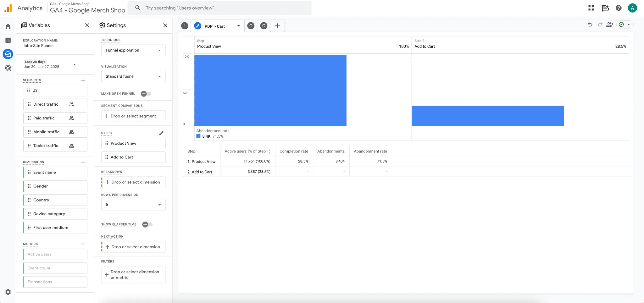
Step 2.Select a new “Funnel Exploration”
This creates a new report. Name the exploration “Intra-Site Funnel”. From here you will create each step within its own tab in the report.

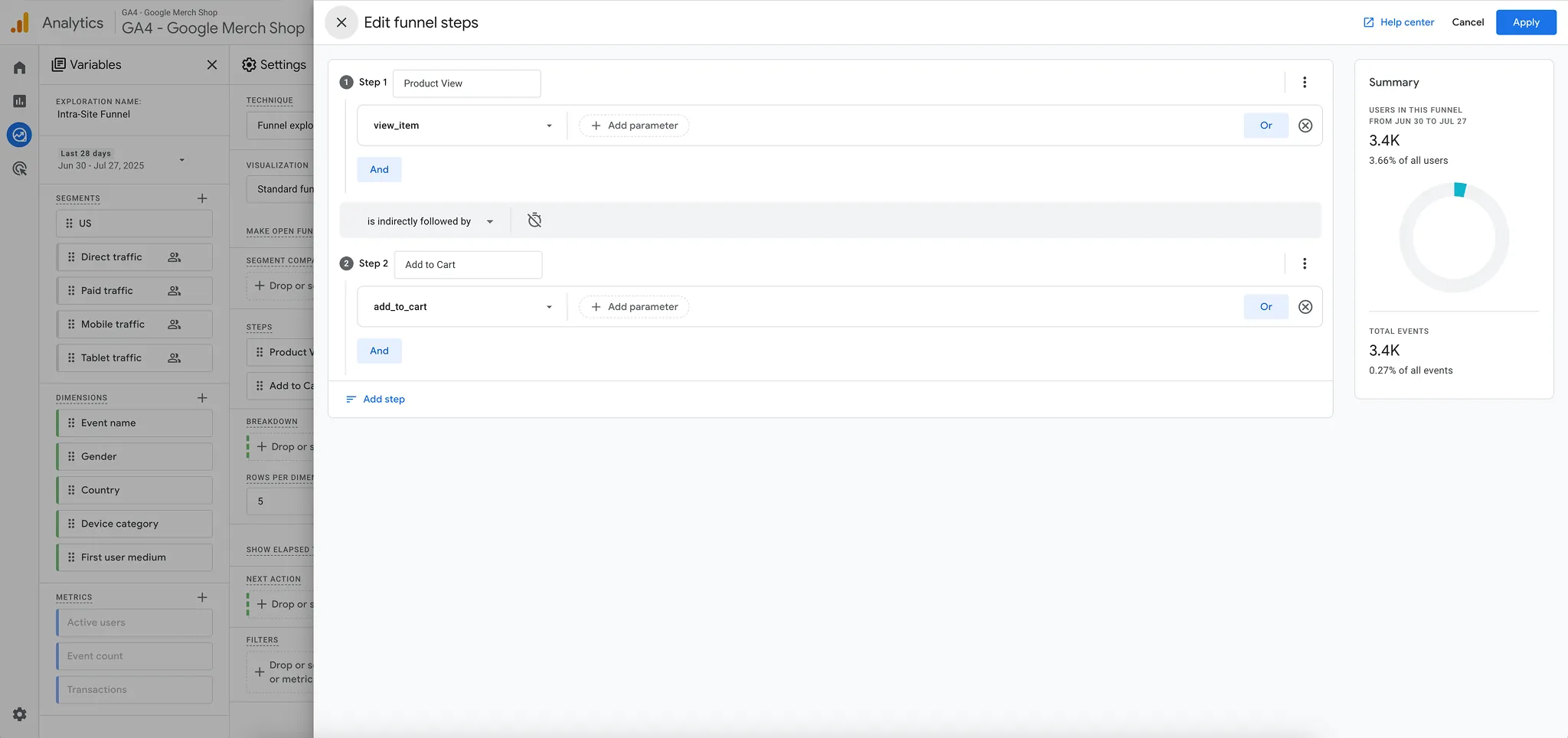
Step 3.Set up each step in the funnel
- Create Landing → Product View tab
- Landing: landing page + query string contains "/"
- Product View: view_item
- Create Product View → Add to Cart tab
- Product View: view_item
- Add to Cart: add_to_cart
- Create Add to Cart → Begin Checkout tab
- Add to Cart: add_to_cart
- Begin Checkout: begin_checkout
- Create Begin Checkout → Purchase tab
- Begin Checkout: begin_checkout
- Purchase: purchase
Step 4. Add dimensions
In the left hand column click the “+” next to dimensions. Here you can search and select dimensions to add to your exploration.
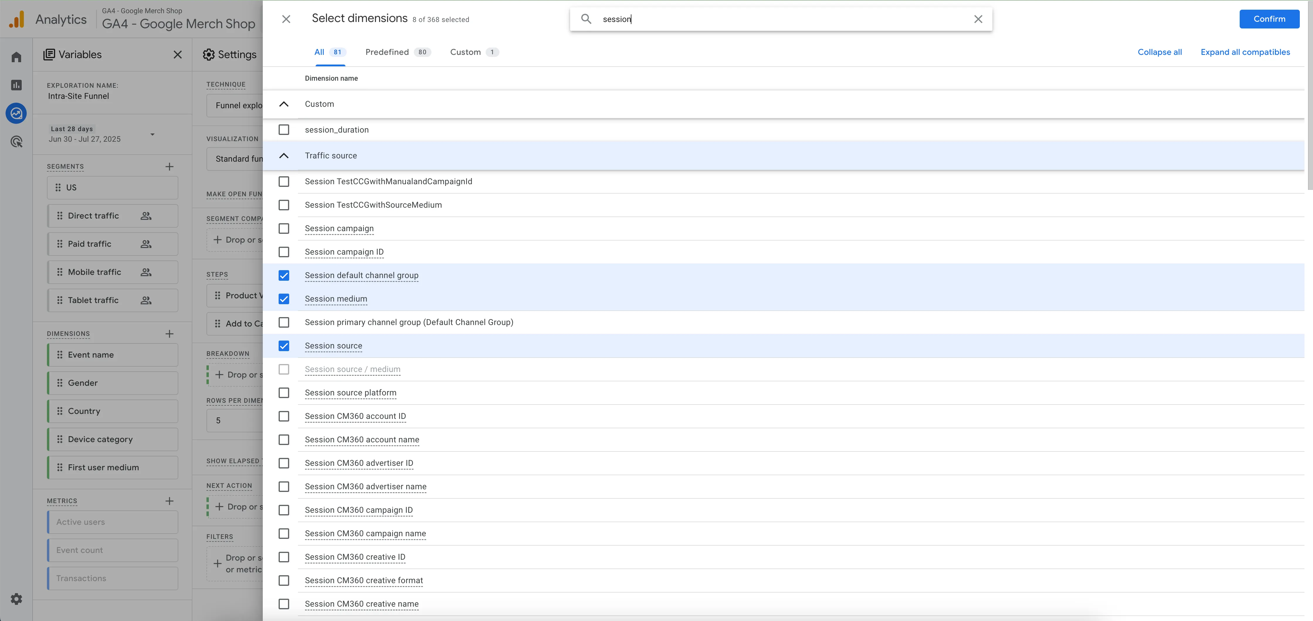
Our standard recommendations include:
- Landing page + query string
- Device category
- Session default channel group
- New / established
- Country
Many more can be added as necessary later, however this list is what we use to populate our initial “master list” when auditing a store for the first time.
Only one dimension can be applied to the report at a time. The easiest way to navigate this is by applying them as filters in the bottom of the second column.
Example Scenario:
If you wanted to zero in on how paid social traffic PDP → Cart performance varied by device, you could:
Add a filter where session default channel group exactly matches “Paid Social”
Then, apply device category as a dimension.
This would allow you to see any potential performance differences between desktop and mobile devices. More on this later.
Date Range
Depending on your store’s traffic you may need to adjust your date range for better analysis. We default to the last 30 days. It generally provides enough data to smooth out any anomalies without getting into data sampling issues.
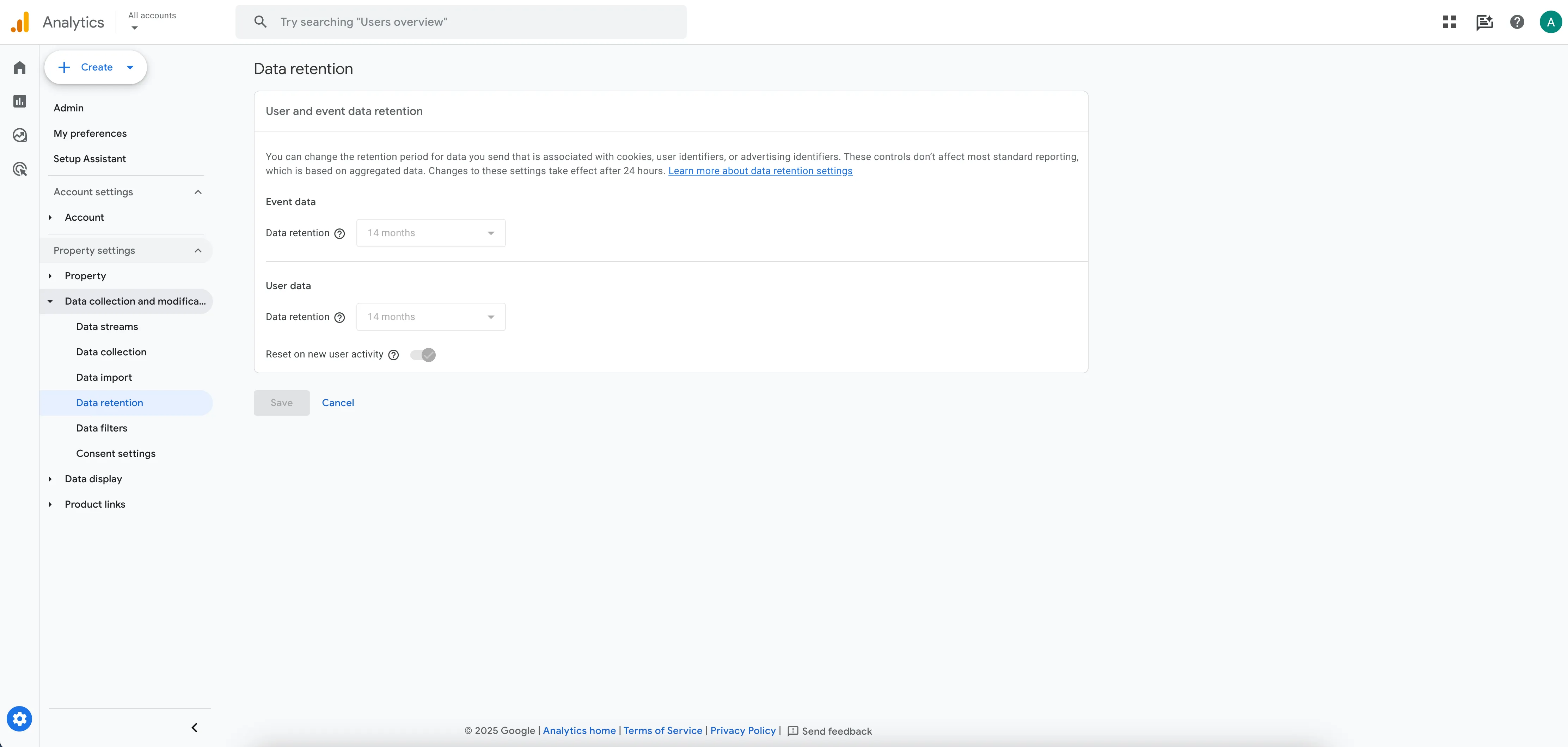
Data Retention
A housekeeping note for your instance. If you have not done so already, adjust your event data retention for your GA4 instance from 2 months to 14 months. The Intra-Site Funnel runs on event data, and making this shift will allow you to better see changes in performance over time.
Adjusting is as simple as going to Admin → Data Retention → Event Data → Data retention equals 14 months.
Traffic channel expectations with the Intra-Site Funnel
Different traffic sources have different temperates.
Someone intentionally typing in your site to their browser likely has much higher intent than someone casually scrolling Instagram and stopping by for a fleeting moment.
Understanding where different channels “should” be on each ISF metric is a helpful way of evaluating which channels are working well, and which might need some improvement.
For most stores we would expect channels to function something like this:
Email/SMS > Direct > Organic > Paid
Let’s break down each channel grouping a bit more.
Email & SMS
Email and SMS traffic is extremely high intent. They are in your Klaviyo database and should outperform just about any other channel regardless of the metric. These users should come in significantly above target ranges.
Direct
Direct traffic similarly shows high intent. These are users who are proactively seeking out your site, not casually stumbling onto it. Direct users are a great proxy for motivated users. If this segment is not converting sufficiently high something is seriously amiss. These users should also measure above target ranges on Intra-Site Funnel metrics.
Organic
Organic traffic can be a mixed bag. Organic search or shopping results indicate a high degree of intent. Where there is a search bar there is demand. Those two channels suggest a user is far along in their journey and is well into their consideration phase. Their session on site is likely capturing demand, not creating it. Organic social on the other hand can range quite a bit. For some stores their organic traffic is a strong indicator of demand. Especially if they use a drop or limited release approach to products. For most however, organic social indexes quite low on most metrics. Overall we would expect organic traffic collectively to slightly underperform email or direct traffic.
Paid
Paid traffic is, for most stores, the engine that makes them go. In many cases it represents the majority of users reaching a site. How it performs depends primarily on a brand’s paid strategy. If they are heavily reliant on Meta, we expect performance to be lower. If they are more invested on Google, expectations are higher. Paid search should be at or above ISF target metrics. It is bottom-of-funnel demand capture. Paid social however is generally the coldest cohort of users. By design they should perform lower on each metric. However if they stray too low there are serious repercussions on scaling spend and profitability.
If we were to rank the individual channels by intent it would look something like this:
- SMS
- Paid Search
- Direct
- Organic Search
- Organic Shopping
- Cross Network
- Organic Social
- Paid Social
Those rankings are by no means absolute, but for the average Shopify store, we would expect performance to fall roughly upon those lines.
Advanced Intra-Site Funnel Analysis
You now know what the Intra-Site Funnel is, how to build it, and some basic data it can provide for you. But now lets dive into the deep end to see how powerful it can be at unlocking insights that help CRO programs thrive.
The easiest way to do this is one step at a time.
Landing → Product View
Definition:A user lands on site and advances to view a product.
How to setup:
Step 1. Landing: landing page + query string contains "/"
Step 2. Product View: view_item
Problem it identifies:How we are users advancing into a shopping experience? Are they able to advance at sufficient rates? Or are they getting stuck somewhere along the way?
Each of those problems are exceedingly common with Shopify stores. Some form of product discovery is an issue in 90% of stores.
In many cases the global metric itself can be masked at a strategic level. When stores drive large numbers of paid users to a product page it can hide deficiencies in navigation, homepage, and collection page designs.
Product discovery is also among the easiest problems to solve. It is a highly functional, UX-driven optimization process. And as an added bonus yields “free” product views for stores once fixed. For every 2-3% Landing → Product View goes up we generally see a 1% increase in Average Revenue Per User (ARPU). This means that product discovery gains still influence bottom line conversion and revenue, and are not merely a vanity metric.
What do we look for on Landing → Product View?
Overall progression
Globally how well are users able to reach a product page? Any top-level fires that need fixing? In our 2025 Intra-Site Funnel Benchmark Report we found stores average a 51% Landing → Product View Rate. If a site is below that level, what are the problem areas we need to press into initially to fix?
Homepage → Product View rate
When users land on the homepage how many end up viewing a product? For most stores, this rate is far lower than you would expect. Often it can be in the 20-30% range. When you keep in mind, these are most likely to be direct users, that begins to show a worrying site design. The most common culprits are things like overly full menus and homepage designs that act a brand element versus a sales channel. If 70% of users who come in the front door never view an item, that is a problem.
Collection Page → Product Page progression
PLP’s should be an easy pass through to viewing a PDP. Instead many overwhelm users by making it too hard to narrow down the available products. We want to know what is the overall rate of progression, as well as the rough differences between broad and narrow collections. Sometimes you will see a narrow collection have 75% PLP → PDP rates while a “shop all” collection only has a 35% rate. In that case, filters and quick filters likely need some work on broad collections.
PDP Landing Page → Product View
Seemingly this metric should be 100%. In reality, it often comes in below 90%. Why? Page speed, tag sequencing, bot traffic to name a few. If more than 10% of PDP LP users do not trigger a view_item event something is amiss. Diagnosing a cause is likely to be technical, but can be extraordinarily helpful when it comes to making the most out of paid traffic. If Meta sees 30% of traffic appear to bounce of the site immediately it does not bode well for your brand’s future algorithmic success.
Landing → Product View, “excluding” PDP LPs
This is one of the more telling data points for a site. When you filter out all users landing directly onto a PDP, how well does the site drive product views with the users that remain? If it is below 40%, there is work to be done on your homepage, collection pages, navigation menus, etc.
Direct Users, Landing → Product View
Remember, these are a proxy for high-intent traffic. In many cases this segment becomes a representation of your site’s current ceiling. If a motivated user can advance to view a product only 35% of the time, something is off. However if they are advancing at significantly higher rates than colder channels, then perhaps there is additional education or nudging necessary for the less familiar audiences.
Search / Navigation Usage → Product View
The larger the catalog is, the more important these elements becomes for a store. And, if you are savvy enough to create an event for interaction you can apply the same funnel logic to see how it impacts progression rates. When we use these events we are analyzing two things. One, how often are users searching or interacting with the menu? Menus tend to be used heavily, search can be an afterthought. On sites with large catalogs that can be a mistake. Two, when used, how does that impact progression to viewing a product? If these elements majorly improve product discovery it becomes worth it to test different hypotheses for increasing their prominence with users.
Device comparisons
It is not 2015 anymore, we expect parity between desktop and mobile devices. When product discovery differs by more than 10-15% this indicates that there is a responsiveness issue. Something that is helpful to users on one screen size is likely not visible on another. The usual culprit is menus. So many sites are built with beautiful mega menu designs that simply do not translate well to mobile screen sizes.
High intent vs. low intent progress
Naturally you shouldn’t expect all traffic channels to advance at the same rate. However, you should keep an eye out for underperformance amongst high intent channels. If users landing directly or via email/sms are not reaching product pages that is concerning. If anyone should be able to find their way through, it is those groups. On the other hand if the gap is too big between high and low intent channels this might indicate that familiar users know how to zero in on the right product, but colder users have no idea what is right for them. Finding a sweet spot that doesn’t interfere with motivated users but still guides new users is imperative.
Landing on vs. Passing Through
Sometimes the same page can perform wildly differently depending on what it is being asked to do. We see this commonly with PLPs. For example a best sellers page may not function well at all when landed directly upon. These pages often lack reassurance for users, and the full breadth of products might not be apparent. That can cause PLP LPs to have low product discovery rates and high bounce rates. Yet the same PLP can work just fine when it is an intermediary page. Users are oriented elsewhere upon landing, and need a minimalist experience to advance. Looking at high traffic pages through both “Landing page + query string” and “page path + screen class” dimensions can illuminate this further.
How to Fix Landing → Product View Issues:
To be clear up front - there are no universally successful designs. Thousands of tests have shown that what every popular test concept can be right, or wrong. That is why having a framework and markers for performance is so important.
However, there are consistent places where you can influence behavior for each Intra-Site Funnel metric and being cognizant of them up front is an important first step to improving them.
Navigation Menus
Your navigation menu is one of the most-interacted with elements on your site. Upwards of 30% of visitors can use it in a given session. Therefore nailing the content is important. The exact details will defer depending on the breadth of the catalog. However, our general recommendations include:
- Avoiding branded terms
- Default to product categories as the top level of navigation
- Separate shopping links from brand links (about, contact, etc.) -those are better in the footer
- Use a maximum of ~6 top-level navigation options
.webp)
Homepage Hero Sections
Get too cute with the homepage hero at your own peril. There is a high degree of hero blindness on Shopify stores. Despite it being the first thing users see, they instinctively assume what is there is not relevant for them and see out other avenues into the site. In other cases it becomes too political of real estate to commit to a single goal which leads to slides or otherwise unclear language. Avoid this at all costs. When in doubt stick with a single message leading users to a best sellers collection. Homepage users tend to be returning users / customers with some baseline familiarity on your products, adapt accordingly.
.webp)
Homepage “Shop By_” Sections
A personal favorite of the Enavi team. Shop by sections allow users to shop by category, outcome, most popular, etc. In an era of mobile dominated traffic these sections allow users to see the breadth of the product catalog, without needing to open a menu, and choose the right path forward for them. In many cases a shop by section will outperform a hero section on driving product views despite being further down the homepage.
.webp)
Collection Page Headers
It is easy to do too much or too little with a collection page design. Too much imagery and copy and it will push the product grid below the fold. Too little orientation and users landing on the page will bounce at higher rate. In most scenarios we encourage you to skip the branded imagery and opt for a clear title and a line of two of supporting copy. The goal is to leave no doubt what the user can find on that page whether they are arriving on or just passing through. This keeps the product grid above the fold, which yields increased interaction, and ultimately more product views.

Collection Page Grid
We subscribe to the one goal per page philosophy for a store. When it comes to PLP grids, we see little data that support adding product quick views or quick add to cart buttons. Product pages are designed to be more persuasive, we would rather default to users finding that information there, versus trying to make a decision based on what they see on a quick view card.
Collection Page Filters / Quick Filters
Filters get easily overcomplicated. Many sites structure them entirely with the desktop experience in mind. And many more are not well structured with metafields for proper filtering results. That causes users to either use traditional filters and become frustrated or to ignore them altogether. Increasingly our preference is to streamline the traditional filter options, removing any elements that are not frequently used. And, especially for broader collections, consider adding quick filter buttons to rapidly narrow down product selection. Quick filters are especially helpful on mobile dominant sites as they can show the full product range on large collections like “Shop All” or “Best Sellers”.
Search Bar
Search can be a vital option for product discovery, or it can be a non-entity. Most of the time the difference lies in catalog size. The larger the size, the more search becomes the default jumping off point for finding the right product. There is no hard and fast limit to when to prioritize, but once you have a few dozen of products in your catalog, it is probably worth a test for having an always visible search bar in your header.
Product View → Add to Cart
Definition:A user views a product page and adds an item to their cart
How to setup:
Step 1. Product View: view_item
Step 2. Add to cart: add_to_cart
Problem it identifies: How well can the site’s sales pitch motivate users towards purchasing? Does it only work for users who arrive pre-sold? Or can colder traffic efficiently be exposed to the store and still convert effectively.
Most stores see strong Product View → Add to Cart rates for their high-intent audiences. These are users who are almost buying in spite of the site experience. They were so sold that no reasonable amount of friction will stop them.
Where stores struggle is with colder sources of traffic (e.g., Meta). The PDP for most stores does not:
- Connect the pre- and post-click experience well
- Communicate the benefits in a customer-centric way
- Proactively address known objections that customers have
The biggest improvements we see in PDP performance are subtle, often subtraction is just as powerful as addition. The end result is clarity for the user. Clarity of why the product is right for their needs, and why this brand is the right place to purchase it from.
Ultimately improvement on this step is one of the biggest force multipliers a store has, which is why that 12% target rate is so vital. Improving PDP → Cart makes it easier to scale ad spend, and it generally has a strong halo effect for cart and checkout completion.
What do we look for on Product View → Add to Cart rate?
Device specific performance
How does PDP → Cart compare on big and small screens? For commoditized products the gap is likely narrower. But for more unique products we tend to see a bigger delta between desktop and mobile performance. Generally this means something is seen on a desktop device that helps motivate that is absent from mobile. If so, we need to reverse engineer what that might be. If performance is equally poor on both categories we can work freely knowing that nothing is truly working and we likely need to add or adapt to the experience first and foremost.
Channel specific rates
What does the distribution look like for performance by channels? Does it fall roughly like we outlined earlier? Where is Meta performance at in particular? If it is less than 5% alarm bells need to be sounding. Regardless we try to normalize channel performance by devices as well to get the most accurate read. If it is just paid social that is struggling, that tells us we need to adapt the site for a colder audience, without disrupting motivated users. If everything is below target rates then we might need to rethink the whole sales pitch. Again, we can use direct / none users as a solid proxy for intent. If those users are well off the target rate it is likely we have much work left to do.
Performance By Product / Product Type
Are all categories and products performing in the same range? Or are some higher and lower? It is entirely possible that some product types do a great job of motivating users and leading to purchase, while others lack vital information needed to sell properly. Isolating in this way allows us to triage the product catalog in a way that improves performance the fastest.
Known out-of-stock issues
Related to the previous bullet, if there are periods of OOS issues, we want to factor that into our analysis. It is very easy for a product to look like it is performing terribly, when in reality users had no ability to buy. There are advanced methods for how you can track this within GA4. But in most cases simply knowing rough data ranges can be enough to isolate anomalies and provide accurate analysis otherwise.
Custom Click Events → Add to Cart
Funnel explorations are one of the biggest strengths of GA4. When you have click events setup on a PDP it allows you to see how interaction affects progression. For example, if users who click on a “warranty and guarantee” accordion add to cart at 18% and the site average is only 13% that could indicate an opportunity to shine more light on that angle. Repeating this process throughout the PDP allows us to go beyond heatmaps and clickmaps to see which elements are contributing the most and the least to progression and adjust the experience accordingly.
How to Fix Product View → Add to Cart Issues:
Copy-led adjustments
Sales pitches, elevator pitches, short descriptions, however you want to label them, those two to three lines of copy on a PDP are golden. When done properly they showcase why someone should buy connecting the dots between the pre- and post-click experience. These adjustments can easily lead to double-digit add to cart and ARPU improvements.
.webp)
Image gallery changes
Shoppers are used to swiping through image galleries. Increasingly this appears to be a dominant behavior. Adapting your experience accordingly is important. Instead of leaving crucial information further down the page, where many users will not see it, weave it into the image gallery. Aim to provide a full sales pitch even if a user never sees anything more than the product image gallery.
.webp)
Buy box reassurance
When users begin the buying process they are met with decisions around size, color, quantity, frequency and more. Each of those induces particular types of anxiety. It is best to address that anxiety in the moment and not further down the page and elsewhere in the site. Tooltips, modals, and proper product linking allows for a seamless experience that reinforces that users are making a good decision in the moment.
Above the fold orientation
For most Shopify stores the front door to your site is not the homepage, it is the above the fold section on your product page. We often find that experience lacking. Product image aspect ratios, stacking announcement banners, overlaid apps, and more combine to create a disruptive experience. When you are dealing with easily-lost users, that is detrimental. Make sure that users are reassured they are in the correct place when they land, via a combination of text and images, so that they do not immediately exit.
Sub-ATC sections
The real estate directly under an add to cart button is a great place to reassure the persuadable users to take the next step. Rather than employing vague language we commonly like to reinforce the uniqueness and safety of the brand. Specifics help. If the brand has been around since 1923, call that out. Same if it is hand crafted in a Brooklyn garage. Highlighting those elements will differentiate your store experience from the commoditized experiences that plague most Shopify stores.
Negative testing
Improving PDP performance can be as much about subtracting as it is adding. When you are working on a 390x844 canvas available space is limited. You want to reinforce that every element has earned its placement. A/B test hiding elements with little interaction (using heatmaps, clickmaps, custom events) to see if removing them causes a difference in performance. If not you can easily remove and use that space for other content, or simply to let what remains breathe a bit more.
Add to Cart → Begin Checkout
Definition:A user adds a product to their cart and then enters the checkout process.
How to setup:
Step 1. Add to cart: add_to_cart
Step 2. Begin Checkout: begin_checkout
Problem it identifies:
How serious are users when they add to cart? Is the cart functioning as a wishlist or a serious indicator of intent? If it is the latter, then how effective is the current experience at driving users forward? Is there any undue friction added or anxiety introduced through attempted upsells or related AOV tactics?
In most cases poor Cart → Checkout rates are a byproduct of unaddressed anxieties further up the funnel. Sometimes users simply are not sold on the product being the right on for them currently. Other times it is more of a function around the brand not being seen as a safe enough option, or status quo alternatives being too appealing.
Regardless, this is where purchases begin to become real. That is why we often look to zero in on Cart → Checkout rate first before attempting to move the needle on AOV. In most cases it is better overall to get 50% of users to checkout at a slightly lower AOV than 35% of users at a higher AOV.
That consideration is often overlooked in the discourse around shopping cart experiences. It is for similar reasons that we lean into ARPU or RPV figures so heavily. Elaborate add ons and upsells can backfire if the user is not properly sold in the first place.
What do we look for on Add to Cart → Begin Checkout rate?
Device differences
Similar to previous steps, we want to see if there are genuine differences between desktop, mobile, and tablet devices in checkout. Frequently we will see desktop meet or exceed target ranges while mobile falls far below (even normalizing for channel). Such a gap generally indicates that the clarity of the desktop experience may not be translating over to smaller screens.
Channel differences
Is performance uniform across channels or still varied based on intent? We commonly see gaps in channel performance begin to fade away at the Cart → Checkout stage. If not, and lower intent channels still lag begin high-intent ones we likely need to consider further safety and reassuring elements to the cart experience. A less is more approach to AOV tactics will likely win here. Featured testimonials and safety blocks can be used to great effect. We try to narrow the delta between channels before pressing into pushing additional items or upselling products. On the other hand if all channels are performing around the same level we consider it safer to make those previously mentioned AOV plays.
Screen resolutions
Screen resolution can be a tricky aspect to cart drawers. Excluding any discussions around bot traffic, screen resolution is one of the best ways to hone in on bugs (e.g., elements not being clickable that should be) that are flying under the surface. If you find a particular screen resolution with abnormally low, but not zero, Cart → Checkout rates, it is likely an indicated that something in that experience is not firing properly and needs a more serious review by a developer.
Continue shopping vs. proceed to checkout
How large is basket size? How frequently are users adding to cart and then continuing to shop versus proceeding into the checkout process. If your site has a high number of products per order there is likely a greater need for clarity around the cart drawer. Clarity about what they’ve added and reducing the number of upsells or add-ons is likely a good course of action. On the other hand if users are generally one and done, and straight towards checkout you likely have more flexibility to experiment with merchandizing add-ons and upsells. The sheer amount of space available to you is likely greater.
How to fix Cart → Checkout issues:
Clarity around cart contents
Most cart drawer experiences are created and reviewed on a desktop experience. What looks clean and clear there can be extremely cluttered on a mobile device. Using color and a clear visual hierarchy is helpful to leave no doubt about what is currently sitting in their cart. The last thing you ever want is for a user to see an add-on and think it is accidentally in their cart, become frustrated and then ultimately leave the store. Horizontal, swipeable add-ons tend to help with this versus stacked vertical layouts.
Progression bars
Amazon created an expectation of free, fast shipping. That may not be feasible for most Shopify stores. But at the very least you can use progress bars to communicate what a free shipping threshold is an how close they are to achieving it. The actual threshold levels require a much deeper conversation, but adopting this is a straightforward way to mitigate those concerns without requiring support team conversations.
.webp)
Sub “checkout” trust blocks
Similar to what we encourage under Add to Cart buttons on PDPs, using the real estate under a “Proceed to Checkout” button to address anxieties can be a great way to nudge the persuadable user further along in their journey. We encourage brands to use more functional, fulfillment driven icons and headlines here. Angles such as how quickly the order ships, returns policies, or abnormally low return rates can all inspire trust for a user on the fence.
Begin Checkout → Purchase
Definition:A user adds a product to their cart and then enters the checkout process.
How to setup:
Step 1. Begin Checkout: begin_checkout
Step 2. Purchase: purchase
Problem it identifies:
What anxieties or objections are appearing in the 11th hour to stop a potential purchase? If so, what can you feasibly do about it?
Despite the prevailing wisdom that optimizing closest to checkout generates the biggest impact, we do not find the data supports that. Most Shopify stores do well enough on Checkout → Purchase.
When we encounter stores that struggle at this step it is most frequently related to surprise fees associated with the order or unusually long delivery timelines. This tends to happen most commonly when brands sell across multiple countries. Domestic checkout → purchase can be >50% while international users complete a purchase only 10-15% of the time.
Solving that particular problem has much less to do with actual on-site experiences and far more with overall business operations and logistics. That is why we rarely recommend brands start optimizing here. The solvable problems are generally quite small.
What we look for:
Device differences
We want to confirm there is no device specific wonkiness happening. At this stage we expect parity between desktop and mobile. The Shopify checkout process is familiar enough that the out of the box setup generally does well enough. Confirming this however is still part of our standard checks.
Channel differences
Similarly, we want to confirm that users from all channels are advancing at acceptable rates. Users who reach this point have shown high intent, regardless of where they initially come from. If there are large gaps in Checkout → Purchase rate we want to know why more acutely.
Accelerated checkout usage
How often are all those accelerated checkout options being used? Most brands only have the fuzziest idea as to what this looks like. It is rare but there may be opportunities to elevate or remove particular ones based on performance for a cleaner set of options.
Micro-step progress
Getting the Checkout Funnel events setup properly in GA4 takes more work with the one-page setup, but is still helpful to have. Understanding exactly where users drop off can isolate edge cases that may be holding back users who otherwise would purchase.
Country differences
Finally, we like to see how different markets perform. Are large numbers of users from a particular country advancing through the funnel only to abandon entirely when they see import duties and the like? If so, your ad bugets could likely go further by excluding those countries from your targeting.
How to Fix Checkout → Purchase rate issues:
Reduce unnecessary fields
This step is rarer than in the past as checkout has become homogenized. However, if there are any custom steps that add friction having data to understand the impact can help assess the tradeoffs of removing versus keeping it in the checkout flow.
Simplify accelerated checkouts
The top handful of checkout options (Shop Pay, Apple Pay, etc.) likely dominate usage stats. There may be an opportunity to remove a few options in a way that reduces cognitive load for customers and nudges checkout → purchase up a few percentage points.
Added safety blocks
Adding custom elements to the checkout process is much less common now than it was prior to the checkout extensibility migration. However, in some cases there are still uses for driving home things like brand value props, key fulfillment details, or even featured testimonials. We use these sparingly, but when applicable they can be a decent way to boost rates slightly.
Checkout QA
A surprising amount of bugs can arise in the checkout process, generally related to apps and scripts not always playing well in all devices, screen sizes, browsers, etc. Having a dedicated QA specialist comb through all scenarios where performance is abnormally low can identify hidden issues that otherwise tend to float under the radar.
How Stores Perform On Each Intra-Site Funnel Step
Earlier this year we released our 2025 Intra-Site Funnel Benchmark Report. In it we compiled data from hundreds of Shopify stores to establish distributions for each step. It was the first report of its kind to allow you to compare your store’s performance by percentile. Here is an overview of what we found.
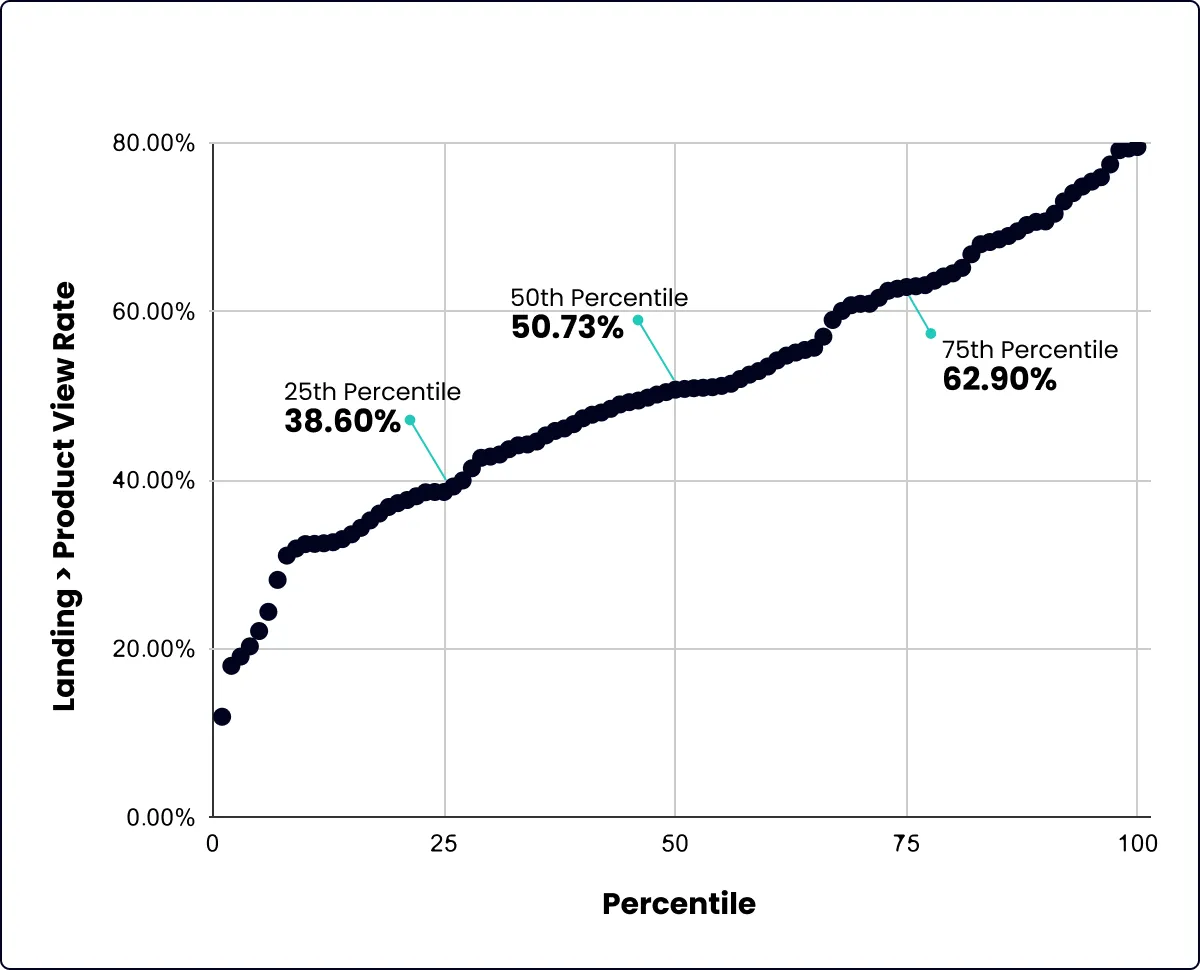
Landing → Product View Rate
Overview: Most stores grade out acceptably on this step by nature of driving a majority of traffic directly to PDPs. When those users are filtered out, stores struggle quite a bit on product discovery.
Percentiles:
25th Percentile: 38.6%
50th Percentile: 50.73%
75th Percentile: 62.9%
Homepage → Product View Rate
Percentiles:
25th Percentile: 29.7%
50th Percentile: 39.27%
75th Percentile: 48.8%
Collection → Product View Rate
Percentiles:
25th Percentile: 33.6%
50th Percentile: 48.12%
75th Percentile: 62.6%
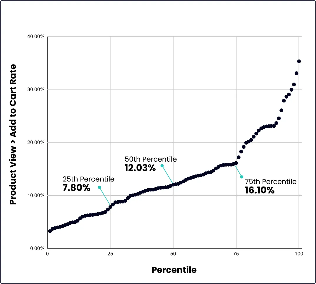
Product View → Add to Cart Rate
Overview:
PDP → Cart had one of the biggest ranges of outcomes. Some stores do phenomenally well on this metric, well above our target ranges. Others come in light years below, often with similar traffic mixes.
Percentiles:
25th Percentile: 7.8%
50th Percentile: 12.03%
75th Percentile: 16.1%
Cart → Checkout Rate
Overview:
Stores are a bit more tightly grouped on Cart → Checkout rate. Even the best performing stores rarely venture much higher than a 50% progression rate on this step.
Percentiles:
25th Percentile: 32.5%
50th Percentile: 42.6%
75th Percentile: 48.00%

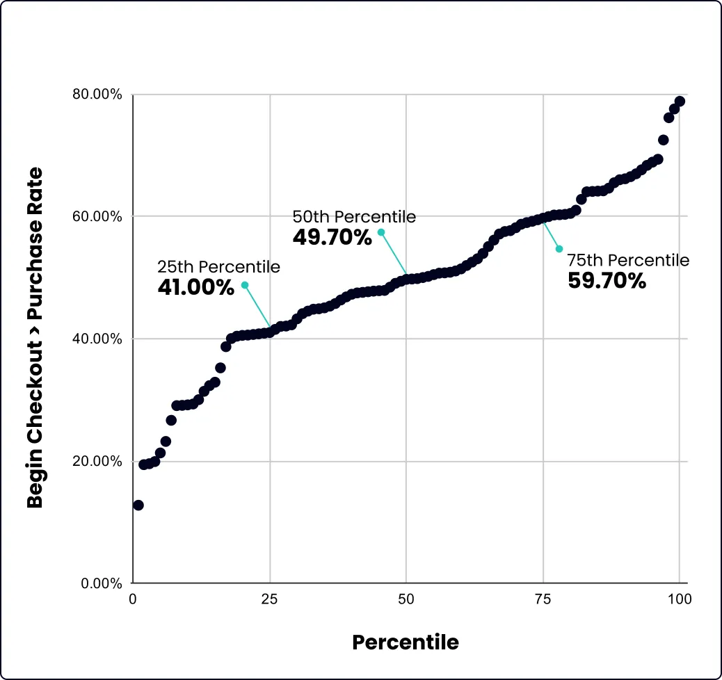
Checkout → Purchase Rate
Overview:
The difference between low- and high-performing stores is again comparatively narrow in checkout. The best stores reach beyond a 60% progression rate.
Percentiles:
25th Percentile: 41.00%
50th Percentile: 49.7%
75th Percentile: 59.7%
Realistic Expectations for improving a Metric on Fire
There has been a serious mismanagement of expectations in the ecommerce CRO space. Claims of doubling conversion rate and million dollar increases from single tests still persist. Let’s rightsize expectations a bit.
When we launch a CRO program with a Shopify brand our forecasting centers around a roughly 10-12% improvement on one of these Intra-Site Funnel steps over a 90 day period. For a previously unoptimized site the real figure can likely be quite higher, often anywhere from 15-25%. On a more mature site, 7-10% improvements are more realistic.
We prefer the most conservative claims possible. Injecting a bit of sobriety into the space is much needed in our opinion.
Once we are operational we fully anticipate to see a 5-7:1 ROI for our clients between test lifts, bug fixes, and forecasted returns from winning implementations (with a serious decay effect applied). For a brand above $10m in annual revenues CRO programs largely pay for themselves. $50+ and that return can be exponentially larger.
Despite all that we try to anchor on improvement on a particular Metric on Fire, often by channel or similar segmentation as well as by Average Revenue Per User (ARPU).
Ultimately though we are operating in ecommerce. The ground is always shifting beneath our feet. So many powerful effects can be washed out in overall numbers. Keeping the larger picture of brand growth in mind our goals can be boiled down as simply as this:
- If a brand is trying to keep traffic steady - a Metric on Fire and ARPU should visibly be going up, we should be able to get more from the same amount of users
- If a brand is trying increase traffic - the Metric on Fire and ARPU should aim to stay level, you have to fight harder to stay in place as traffic scales, but if you can get the same results from colder traffic it is far better for the business.
Conclusion and Action Steps
Ultimately the Intra-Site Funnel is an amazing way for Shopify brands to consistently evaluate their store’s performance. Once you become familiar with it, it is an instinctual way to measure that is immune to many of the complexities that plague the space.
However as good as the ISF is at telling you where problems are, it does not tell you why they are happening speficially. That is where customer research comes into play. Things like post-purchase surveys, on-site polls, customer support tickets, and reviews can all be vital in attacking the biggest issues with your site currently.
Ready to take action on this? Here are a few resources to get you started:
- Step-by-Step Guide for setting up the Intra-Site Funnel
- A free Looker Report that pulls your GA4 data with one-click to diagnose your Metric on Fire.
Or you can have us do it for you with Enavi’s Conversion Audit process.
