


Imagine you own a brick-and-mortar store.
If more than half of the people who came through your front door poked around aimlessly and left without looking at a product, that would be a serious problem, right?
That exact scenario happens far too often in ecommerce.
You can flood your site with all the traffic in the world, but if it is challenging for a customer to find what they are looking for, they are quick to exit. That problem will compromise your marketing budget and ruin your chances of growth.
One of the quickest ways to ramp up product views is to tailor your site's navigation menus to the customer's decision-making process.
From our internal research at Enavi, navigation menus are used in roughly 23-24% of sessions, making them one of your site's most valuable global elements. Overlooking menus as a growth lever is a huge miss.
The Challenge: Xtrema's Product Discovery Problem
We've been helping Xtrema solve this product discovery problem throughout Q2 this year. They came to us with a new website that struggled to generate the product views necessary to hit their revenue target for 2023.
They had a hunch that their existing menu was a partial culprit. But finding an ideal solution was going to require more than mere opinions.
What We Found in the Original Navigation
When our CRO team went to work, we hypothesized that simplification was going to be our friend for a few reasons:
- The existing menu was nested under a single "Shop" section with 29 clickable options.
- No products were linked in the menu. All traffic was routed through collection pages, even though most of their revenue came from a few staple products.

Our Research Process
So we dove in headfirst, looking primarily at Lucky Orange click maps and GA4 Funnel Explorations.
Our goal in all of this was to:
- Find elements that we could remove entirely from the nav menu
- Hone in on the right number of categories to show based on how high-intent users navigated the site already
Key Data Insight
When we compiled our research, a clear trend emerged.
Bypassing collection pages (as much as possible) was to our benefit. Traffic that went through a collection page converted at 3.5%. Traffic that skipped collection pages converted at 7.1%.
With four products accounting for almost half of their ecommerce revenue, skipping the middleman seemed like the way to go. Luckily for us, Xtrema had four core product categories that we could use as the skeleton of their navigation.
What We Removed
Additionally, they had plenty of usable space. Their original menu had sections for:
- Why Xtrema
- Use & Care
- Bundle & Save
Virtually no one clicked on these menu elements, so removing them allowed for a much sleeker test concept.
Turning This Data Into a Test Concept
Shopify makes this reasonably easy. We began building an alternate navigation in the theme. Our concept centered around four top-level categories plus a flexible "sale" category.
The New Navigation Structure
The new top-level navigation structure was this:
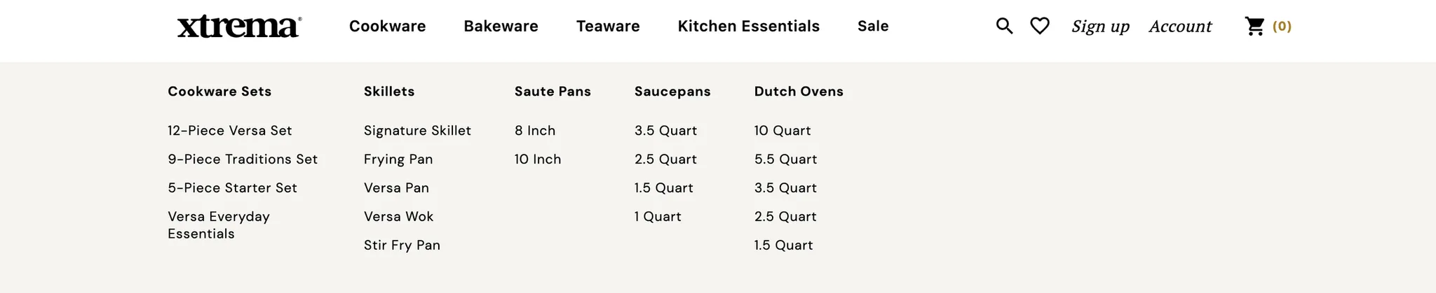
Underneath each element, the column title is still linked to a collection page, but almost everything below sends users directly to a product.

The direct product linking allowed us to remove size from the decision-making process for knowledgeable users in most cases. If you knew you wanted a 10 Inch Saute Pan, you could arrive on the PDP with no additional decisions besides whether to add the item to your cart.
Our Goal With the Test
To see if we could drive more users to product pages with this layout. We had yet to focus on PDP optimization. But the baseline conversion rates for product pages indicated that just getting users there would lead to a major win.
Metrics:
- Product Views
- Conversion Rate
The Test Results
A BIG jump in product views. The new navigation led to a 16.76% increase in product views. Among mobile users especially, the impact was almost 18%.
The Implementation Results
We wanted to be sure and document the pre-and-post-implementation results to validate this big of a lift.
Turns out, the results actually improved slightly after implementing the new version.
- The Navigation Menu Click → Product View Rate grew by an astonishing 65.2%
- The Navigation Menu Click → Purchase Rate increased by an equally impressive 46% to coincide with our earlier data point on CVR for traffic skipping collection pages.
Takeaway
The combination of using the top 4-5 categories as the top level of navigation, plus direct product linking in the menu, was a runaway winner. This result is not surprising. We have seen similar scenarios from testing this with other clients. But especially for brands with a few essential products, being able to link directly to them in the navigation has been universally positive in our experience.
Next Steps
Because of this test result, we experimented with adding another icon-led "Shop by Category" section on Xtrema's homepage to mimic the experience as a pseudo-sub-nav. The results were also amazingly positive for that test, with double-digit increases in product views. Combining these tests allowed us to take a significant bite out of their product discovery issues.
Conclusion
This type of "Shop by Category" focus was beneficial for Xtrema, and we've seen it work well for ecommerce brands where users generally buy a single product at a time.
It has underperformed on sites where users often bundle many items into one purchase. We see a "shop by use case" approach work better there.
Nevertheless, simplifying navigation menus is one of the most powerful levers brands have to ratchet up product views.
